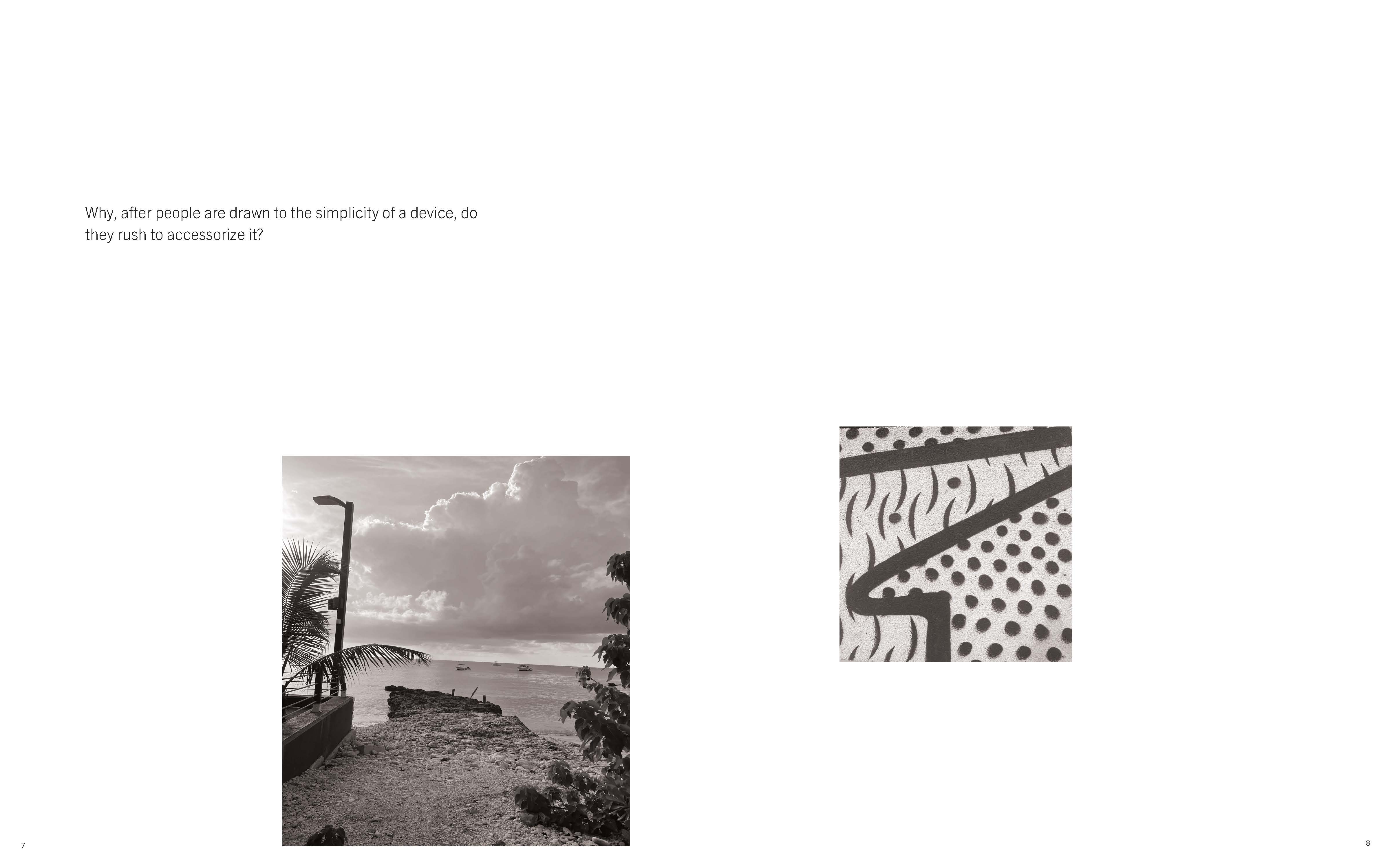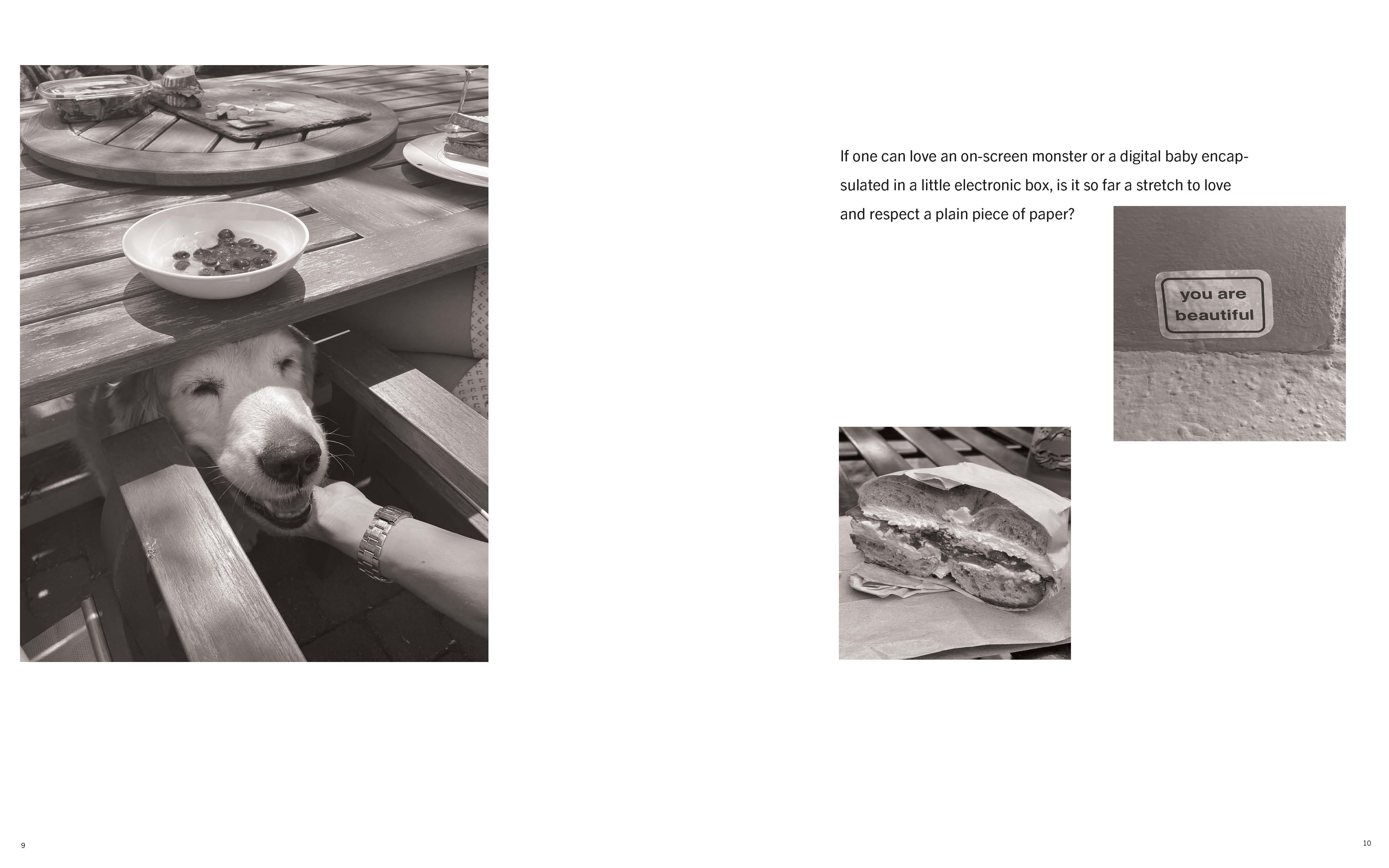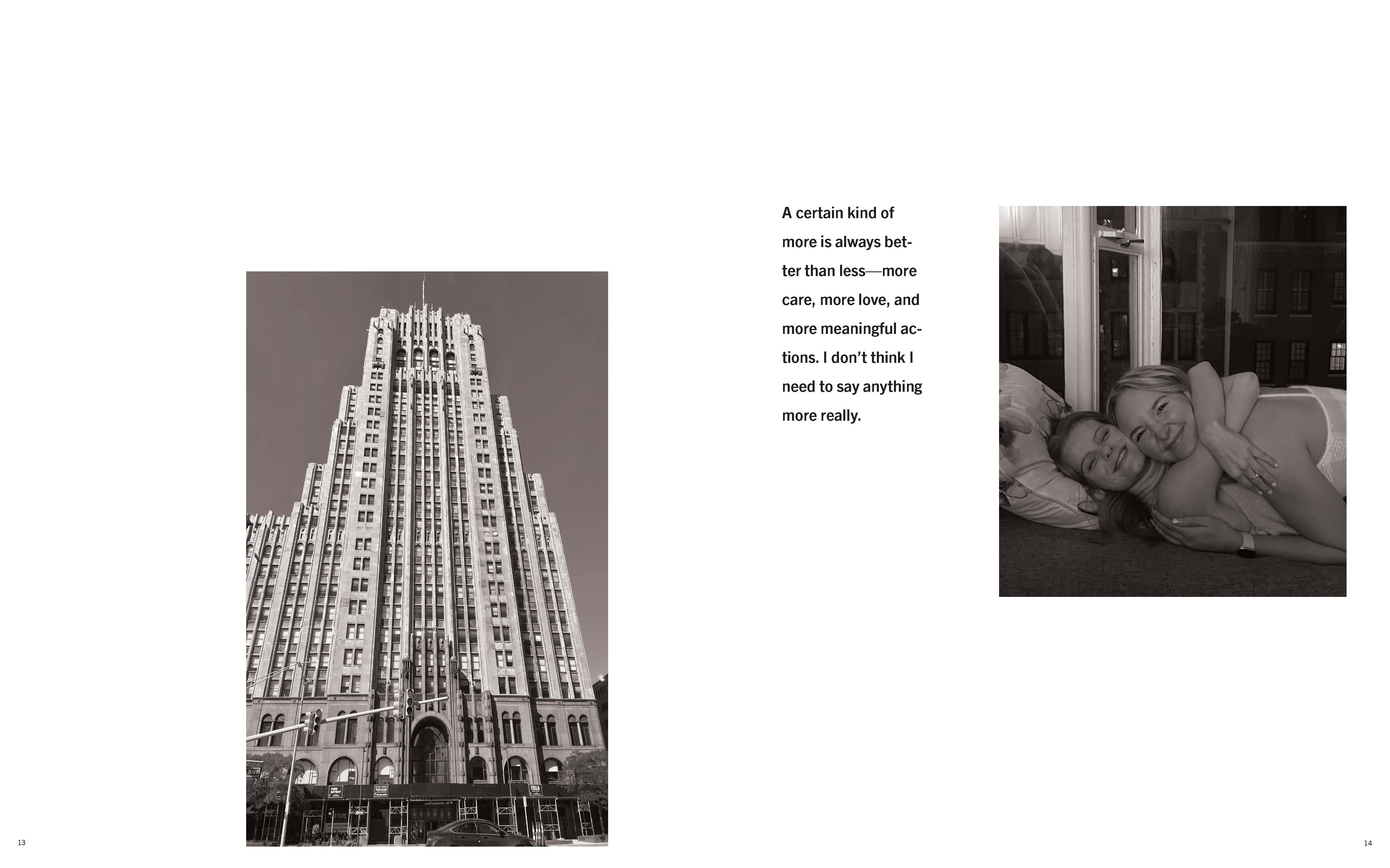
Typography
Laws of Simplicity Book
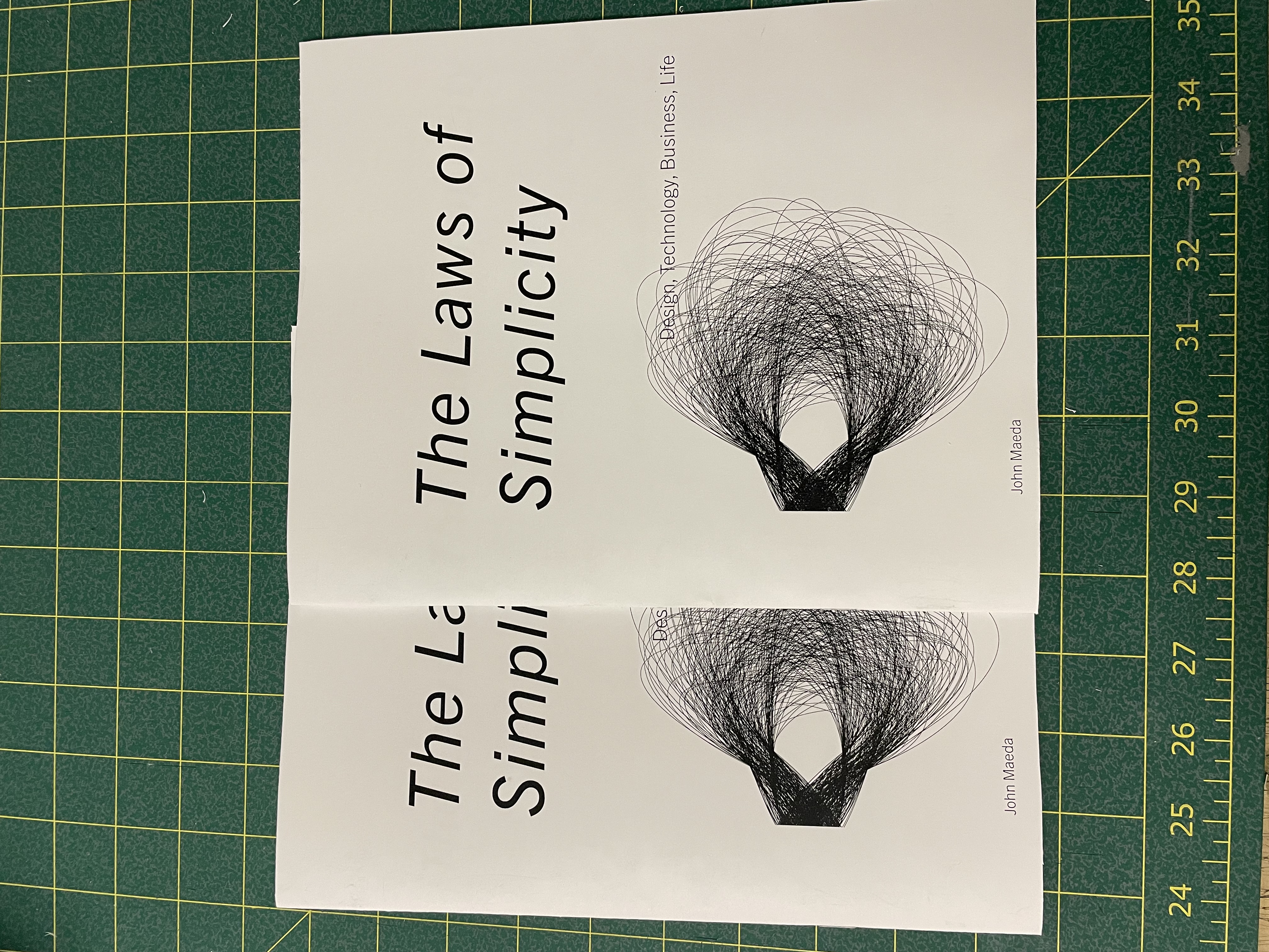
The objective for this project was to create a 16-page book with the use of a grid and hierarchy. Choose two fonts that work well together. Keep it limited to the use of only black and white. For the final project, print, cut out, and bind together the final piece.
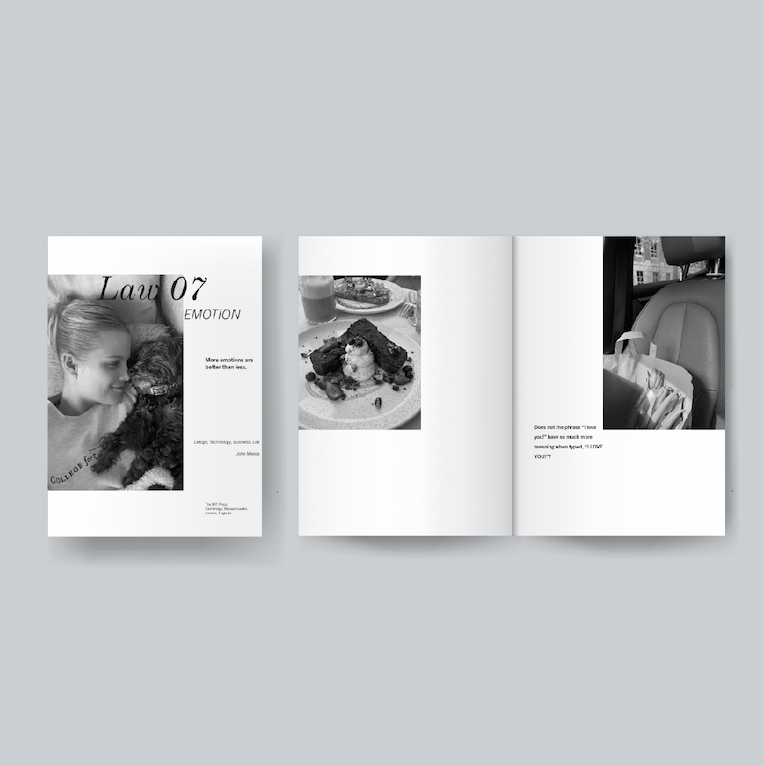
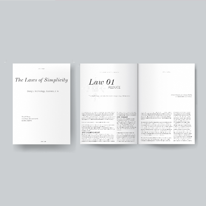
For this project, the goal was to create a 16-page book using text from “The Laws of Simplicity” by John Maeda. I started this project by setting up a grid in InDesign and placing the text to create a clean and consistent placement of the body copy text. I then played around with different iterations of the scale, weight, and textures of the type. I really wanted to play with the idea of very small and detailed typography. I used different weights, small and medium scales, and different curing types. I played with the negative spaces to create unique shapes through text. Once I had designed the files, I printed them out to produce my final craft. I did a saddle stitch for the final project, and cut the pages to perfectly line up.
The big takeaway I learned from this project is how to take content from another person’s work, and design it into my own work. I learned how to style type to make interesting but cohesive designs throughout my book.
Materials Used:
Adobe InDesign
Nikon Camera
Xero Printing
Binding
SCROLL FOR PROCESS ︎︎︎